Cleveland Modern
Role: End-to-end UI/UX designer
Researching, research synthesis, wire framing, usability testing
Tools:
Timeline: May 2025 - June 2025 (~6 weeks)

Background
Problem
Idea
Cleveland Modern is a small business in Cleveland, OH that sells Mid-Century Modern items like furniture and art.
Currently, Cleveland Modern does not have its own website for selling products, instead it relies on websites that host multiple businesses.
A responsive website for Cleveland Modern that allows users to browse the catalogue and buy items directly from the site.
Researching
User Interviews
I conducted five interviews in order to get a deeper understanding of the user’s needs with detailed, qualitative information. One of the five interviews was conducted with the owner of Cleveland Modern.
Essential Questions
Where do you hear about the business you buy from?
(For the business owner) What is the most common way buyers make their purchases? Online or in person?
(For the business owner) How do you intend you website to be used? What functions do you want it to have?

I chose to ask my client, the business owner, a few separate questions I didn't ask users. The business owner had unique insights on trends of user habits that individual customers wouldn't be privy to. The client would also give insights on their preferences for features, designs, and layouts for their website. This was important in making sure my design aligned with the vision for their business.
Affinity Map


Key Insights
Main features interviewees utilized on websites: Search and filter, categories, catalog
3/5 interviewees expressed concerned over buying items they can’t see in person
Trustworthiness is important for purchasing products
Shipping progress, shipping policies, and return policies were considered important
Competitor Analysis


Main Street Modern - Direct
CLE Vintage - Direct
Flux Modern - Direct
Purchasing items, booking appointments, information about the company and markets, restoration, buying gift cards, can sell furniture to Main Street Modern
Website has information about their restoration, items, and upcoming events, able to contact them through their website
Selling items and gift cards, vendor applications from popup events
Not very much branding, brand identity, no search and filter function
Can't make an account
No website
The business has driveway/front porch delivery available on every single item in greater Cleveland/ NEO area
Has semi frequent instagram postings, all purchasing in one place, is on facebook marketplace
Not very much branding, brand identity
Could expand past social media platforms into websites
Purchasing items through the website, about, store hours, press about the business, a form to submit items you’d like to see being sold, a reviews section on items bought, buying gift cards
Ships nationwide
No search and filter function
Key Insights
Information about the company, being able to purchase items from the site, and contact forms are common. Not much branding exists for 2/3 competitors.
Defining
During this process, I used a linear approach, and iterated on wireframes.

Essential POV & HMW's
I’d like to explore ways to help buyers who buy online to purchase items directly through the website because there are multiple third party websites being used currently and having everything in one place makes the buying process easier and cheaper for the seller.
How might we encourage users to make purchases through the website?
How might we provide a useful and easily searchable/filterable inventory for users?
User Personas

Name
Charles Roy
Bio
Charles moved to Cleveland Ohio to start a new job and he enjoys Mid-Century Modern Art. He is looking to decorate his new apartment with artwork from local business, and buy online instead of shopping in person to save time.
Quote
“I’ve always loved having vintage decor in my home, and I like exploring all the different pieces out there. With the large number of items out there, I need a way to do it efficiently.”
Needs and Goals
Frustrations and Pain Points
A platform to buy items directly online and have items shipped to him
A platform to discover different mid-century modern artworks and decorations
A trustworthy business with quality items
Visible return policies/shipping rates and process, quality photos of items
Difficulty finding websites where items can be bought through the websiteNot being able to find businesses with detailed catalogues
Concerns about being scammed or having issues with shipping or damaged items
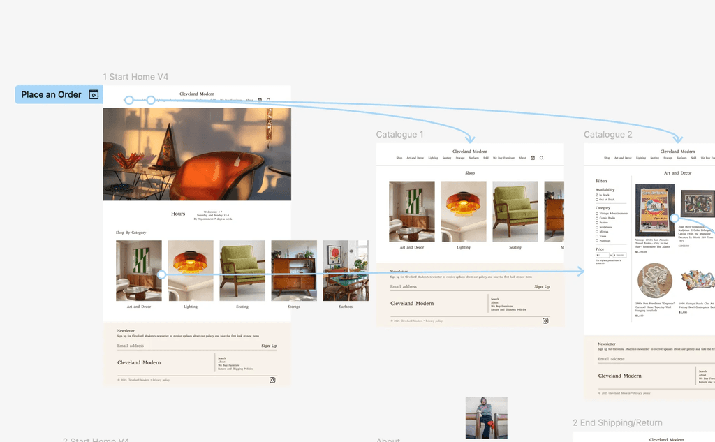
User Flow

Designing
Since I was working with the client to not only design but build the website, the screens were designed to be able to be completed with the layout in website builder the client had chosen. It was a little bit challenging designing within the limitations of that builder.
Low-Fidelity Wireframes
Purchasing item flow
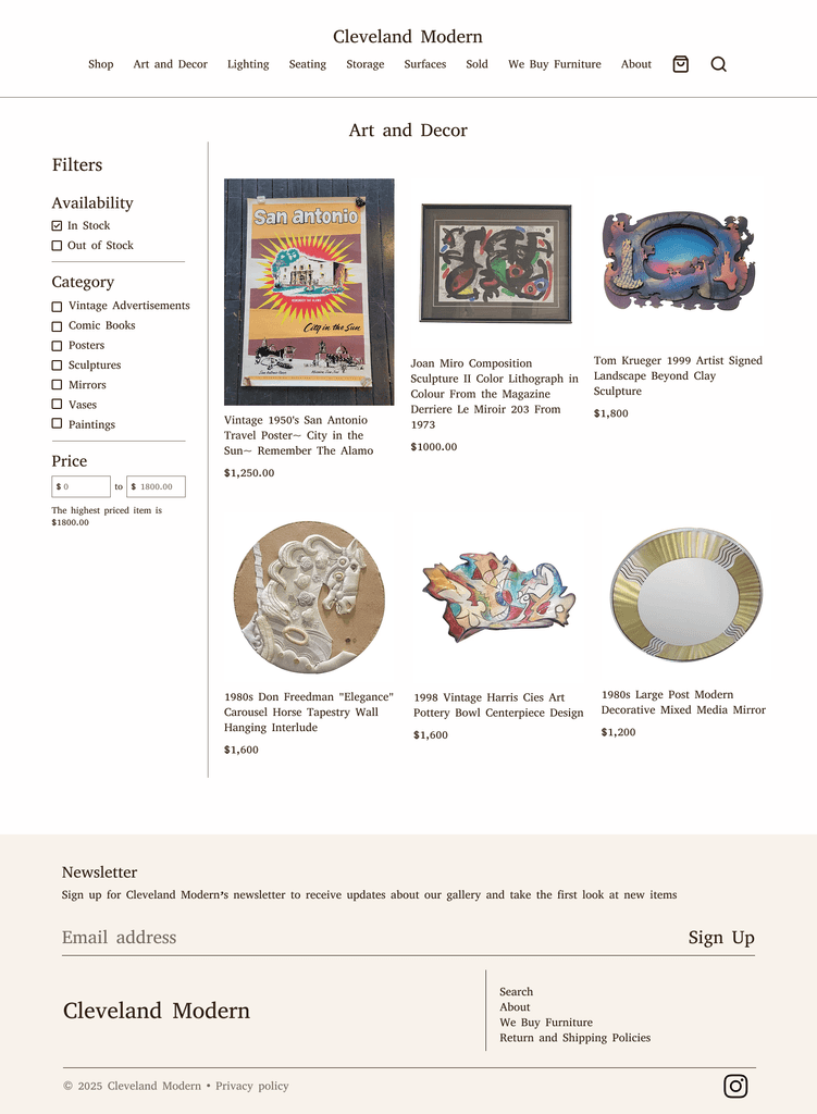
The users will be able to view the catalogue of items available in the store and purchase items on the site.


Contacting Cleveland Modern to sell items flow
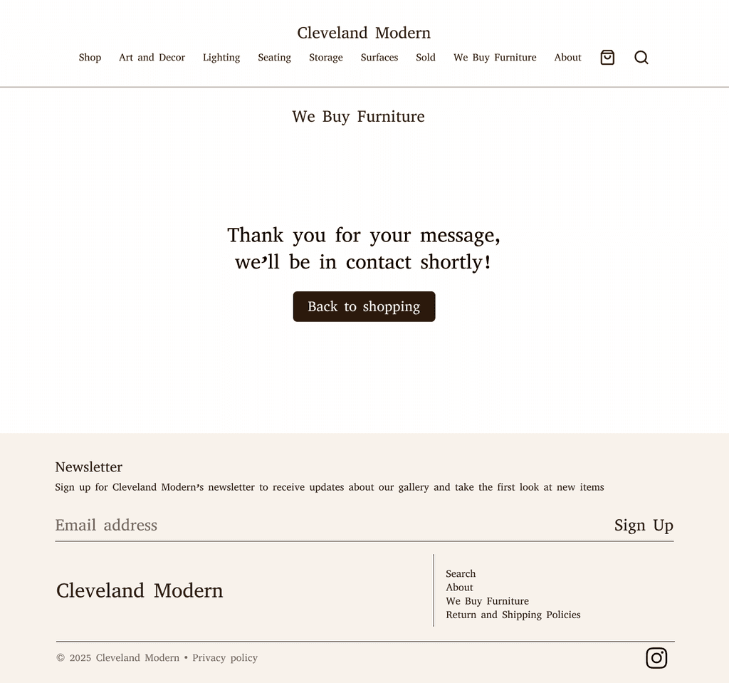
Users can fill out a form to express interest in selling items to Cleveland Modern.

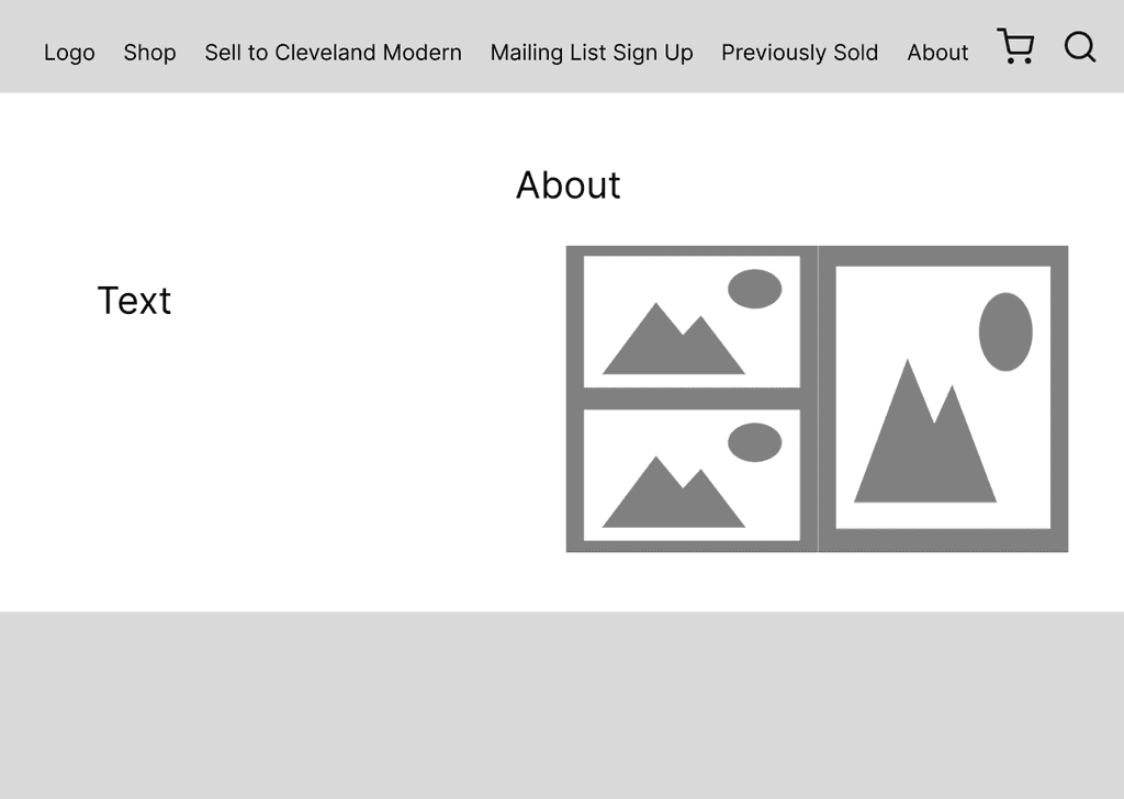
About page flow
Users will be able to learn about Cleveland Modern as a business and information about the shop.
Mailing list flow
Users can enter their email to sign up for a mailing list and receive updates about items and the store.


High-Fidelity Wireframes (Version One)
Purchasing item flow
The users will be able to view the catalogue of items available in the store and purchase items on the site.


Contacting Cleveland Modern to sell items flow
Users can fill out a form to express interest in selling items to Cleveland Modern.

About page flow
Users will be able to learn about Cleveland Modern as a business and information about the shop.


Mailing list flow
Users can enter their email to sign up for a mailing list and receive updates about items and the store.


My favorite part of the design process was designing the overall layout since I enjoyed having input from the business owner and applying their ideas to a prototype.
Testing
Evaluating the usability and usefulness of the wireframes. How effective is the design at helping the user achieve their goals?
Plan
Goal
Tasks
Success metrics
Evaluate the usability and usefulness of the wireframes. How effective is the design at helping the user achieve their goals?
Buy an item
Find “about” the business and its policies
Contact the store to offer to sell an item
Join the mailing list
Time on task
Task success
Number of errors
Additional comments
Results
5 Testers (all unmoderated)
Testing software: Maze
Time on task
Task success
Number of errors
Task 1 avg.: 74.1s
Task 2 avg.: 44.3s
Task 3 avg.: 51.4s
Task 4: avg: 12s
Task 1: 100% success rate
Task 2: 100% success rate
Task 3: 100% success rate
Task 4: 100% success rate
Task 1: 0% of users ended on the wrong screen, 40% misclick rate
Task 2: 0% of users ended on the wrong screen, 79.6% misclick rate
Task 3: 0% of users ended on the wrong screen, 76.9% misclick rate
Task 3: 0% of users ended on the wrong screen, 34.8% misclick rate
User Feedback
Task 1: Expected to be able to access pages through the navigation bar, some buttons were abnormally large
Task 2: Expected to be able to access pages through the navigation bar, using the footer was not the first instinct, about page not usually access from bottom of page
Task 3: Expected to be able to access pages through the navigation bar, nav bar label “we by furniture” didn’t match task instructions
Task 4: Flow was easy to follow
Key Insights
The main issue was that pages were not accessible through the navigation bar, and other access locations were not intuitive
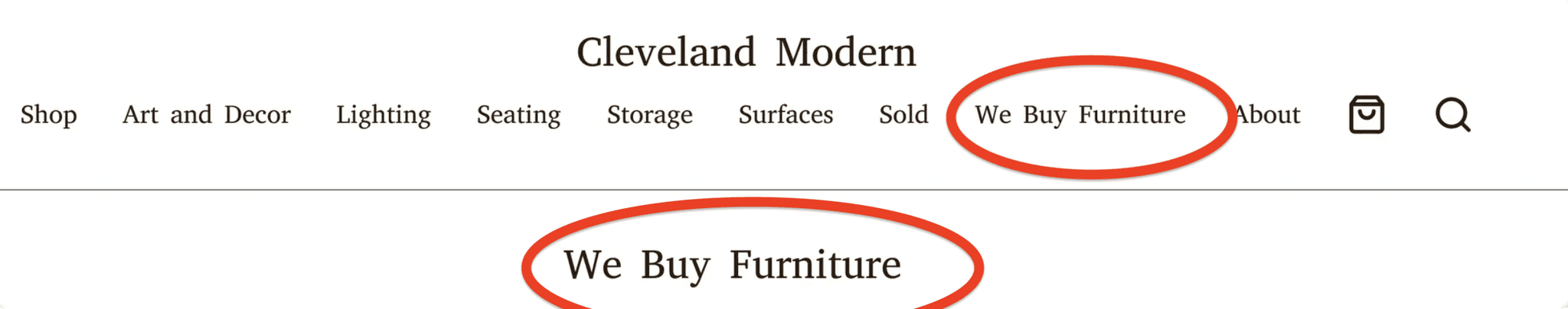
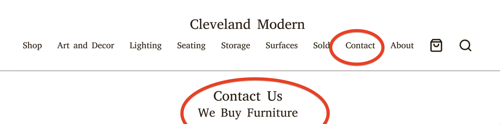
Added flow interaction from navigation bar for flows 1-3
Before


After


Changed “We Buy Furniture” to “Contact” to be more clear and match other similar design patterns
Before
After
Additional Changes
Made buttons and text smaller in flows 1 and 3
Made footer text smaller
Hight-Fidelity Wireframes (Version Two)

Closing
Challenges
One of the main challenges was working on a website that would be made with a template. This required me to adjust my design and my expectations to fit the capabilities of a website builder. I think this also demotivated me a bit, since I would be designing after what a website builder could do and not my own creation.
Growth
Working on this project let me experience the opportunities and challenges of working with a real client. Being able to contribute to a project given to me by a business owner with real needs helped give make my work more concrete and realistic, while also familiarizing me with the process of working with others in a job setting. I also learned how to be more flexible and remain productive while working through scheduling issues and project delays. I also believe I improved my communication skills with non-designers, and being able to share my ideas and listen to and adjust to frequent feedback from a real client.
Next Steps
In future iterations, additional features could include:
Submission forms about items customers might want to see
Sell gift cards for the shop
Stronger branding with logos
I enjoyed being able to work with a real client since no project I’ve done before included this. It helped me experience listening to a clients needs, designing, and adjusting to their feedback when previously, all project ideas had been hypothetical and created by me. These previous projects, though with their own strengths, limited me since I was the one coming up with almost every aspect of design myself, and I was the sole decision maker.

