
Role: End-to-end UI/UX designer
Researching, research synthesis, wire framing, usability testing
Tools:
Timeline: June 2025 (~3 weeks)


Background
Problem
Idea
Café Meow is a hypothetical cafe that has been open for a few years with many loyal returning customers.
The cafe would benefit from online ordering to reduce wait time in the store. Returning customers who order items repeatedly have to respecify their customizations and preferences every time they order.
An app for customers to view the menu and order and pay through the app, with item customizations and rewards. Customizations focus on allergies and nutritional needs.
Researching
User Interviews
I conducted five interviews with participants in order to get a deeper understanding of the user’s needs with detailed, qualitative information.
Essential Questions
Do you use rewards? Do you find them helpful?
Do you make an account on restaurant's apps?
Have you had any issues using those apps?
Affinity Map


Key Insights
5/5 made accounts on websites and apps and used order ahead, order customization, rewards, and order history
2/5 users customized for allergies, 2/5 users customized for nutrition, 3/5 users customized for preference
5/5 used rewards, but 2/5 didn’t actively check rewards, only used them when available
Most issues with existing apps was not being informative (in terms of fees, nutrition, allergies, order confirmation, store location)
Competitor Analysis

Starbucks - Direct
Dunkin' Donuts - Direct
Chick-Fil-A - Direct
Get and redeem rewards, pay in store, order ahead, send gift cards, order customization
Strong brand identity and well functioning app
Signature items like Frappuccinos
Not as much investment into their food products
Keeps up with new drinks and holidays
Popular internationally
Allowing to pay through the app for mobile ordering and using the app as a form of pay
Get and redeem rewards, order ahead, send gift cards, order customization, order from the car
Strong brand identity and a well functioning app
Meal deals
Not as well known internationally
Doesn't have items like signature drinks
Keeps up with new drinks and holidays
Get and redeem rewards, order ahead, send gift cards, order customization
Strong brand identity and a well functioning app
Meal deals
Signature items like waffle fries
Not as well known internationally
Key Insights
Rewards, order ahead, gift cards, item customization, and strong brand identity are essentials in competitor apps.
Defining
During this process, I used a linear approach, and iterated on wireframes.

Essential POV & HMW's
I’d like to explore ways to help people who have specific dietary needs or preferences to be able to search for and customize items to fit their needs because being informed on nutrition and allergens is important for people’s safety and saves time that would’ve been spent trying to research that information.
How might we inform users of necessary dietary information?
How might we allow the user to modify an order to suit their needs?

Based on responses from user interviews, it was evident that order customization was a must. Interviewees expressed wanting to customize orders for a myriad of reasons, so a focus of my flows was detailed nutritional information and order customization that would update that information with changes.
User Persona

Name
Jeremy Knox
Bio
Jeremy is a college student who has a busy schedule with classes and sports. He loves going to a local cafe near his campus for coffee, but he runs short on time often and can’t wait in line for a drink. As a student athlete, he’s often on the lookout for nutritional foods and deals that save him money.
Quote
“I’m always on the go and finding ways to save myself time and effort are always helpful. I’d love to be able to reorder my same favorite coffee and sandwich without having to respecify my more nutritional variations of them every time I order.”
Needs and Goals
Frustrations and Pain Points
Order ahead for his favorite cafe
Customizing items to fit his dietary preferences
Rewards for making purchases
Order history to order his favorites
Menus in restaurants lacking nutritional facts
Fees that don’t appear until the end of the ordering process
User Flow
Sitemap

Designing
Low-Mid Fidelity Wireframes
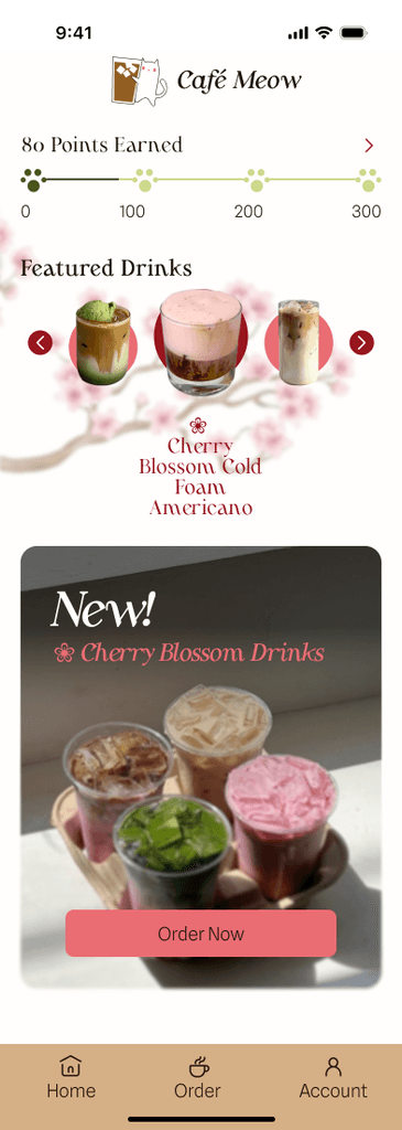
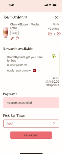
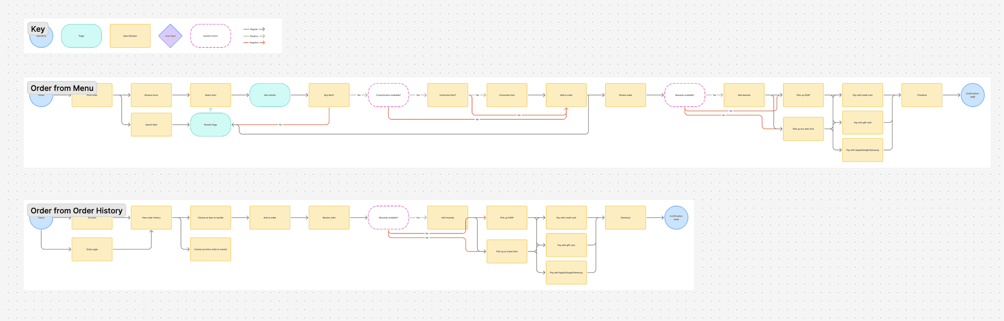
Ordering an item from the menu
The user will be able to order items on the app for in-store pick up, customize that order, and cash in points from rewards.


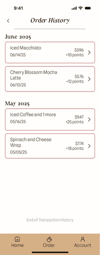
Ordering an item order history
If a user is logged into an existing account, they can reorder previously ordered items with the same customizations..


Branding
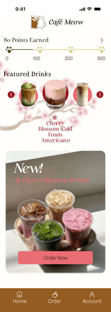
For brand identity, I wanted to choose colors that would stand out from other coffee shops, while still retaining associations with coffee and food. So, I choose pink, green, and brown to for a fresh and lively appearance. The font was chosen to complement the bright and elegant yet minimal contained color scheme. For the logo, I also chose an icon that I believed was friendly and memorable. This was created through a series of drafts and chosen in a group critique session.


High-Fidelity Wireframes (Version One)
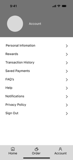
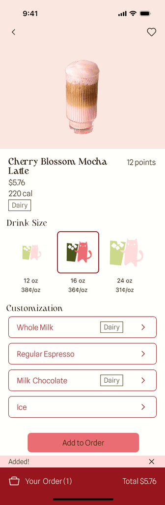
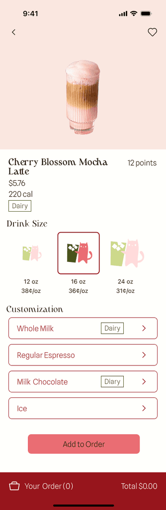
Ordering an item from the menu
The user will be able to order items on the app for in-store pick up, customize that order, and cash in points from rewards.


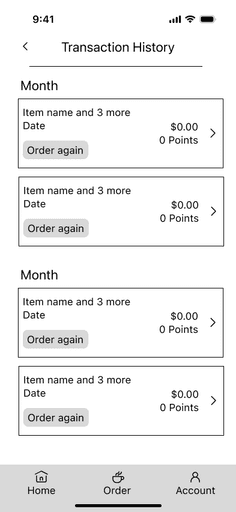
Ordering an item order history
If a user is logged into an existing account, they can reorder previously ordered items with the same customizations..


My favorite part of the design process was branding. I enjoyed working through the process of understanding my brand's identity based on core values, and coming up with logos, colors, and fonts to represent those values visually.
Testing
Evaluating the usability and usefulness of the wireframes. How effective is the design at helping the user achieve their goals?
Plan
Goal
Tasks
Success metrics
Evaluate the usability and usefulness of the wireframes. How effective is the design at helping the user achieve their goals?
Order a coffee drink without customizations
Order a coffee drink and customize to remove allergens
Order from order history
Use Rewards
Time on task
Task success
Number of errors
Additional comments
Low-Mid Fidelity Testing Results
7 Testers (all unmoderated)
Testing software: Maze
Time on task
Task success
Number of errors
Task 1 avg.: 44.4s
Task 2 avg.: 33.7
Task 3 avg.: 19.6
Task 4 avg: 10.3s
Task 1: 66.7% success rate
Task 2: 66.7% success rate
Task 3: 100% success rate
Task 4: 100% success rate
Task 1: 33% of users ended on the wrong screen, 72% misclick rate
Task 2: 33.3% of users ended on the wrong screen, 69.8% misclick rate
Task 3: 0% of users ended on the wrong screen, 12.8% misclick rate
Task 4: 0% of users ended on the wrong screen, 14.3% misclick rate
User Feedback
Overall: The cart is hard to find and caused some users to stop the task early
Task 1: Hard to figure out how to checkout, the “added” pop-up was used to try to continue forwards, placement of the cart was unclear
Task 2: Instructions were hard to understand, placement of the cart was unclear, allergy labels looked like buttons, ingredient customization buttons looked like multi-select instead of single select
Task 3: None
Task 4: None
Sometimes it was hard to tell when a page was scrollable
Maybe elements should look cut off so you can tell there is more of the page left
High-Fidelity Testing Results
User Feedback
5 Testers (all moderated)
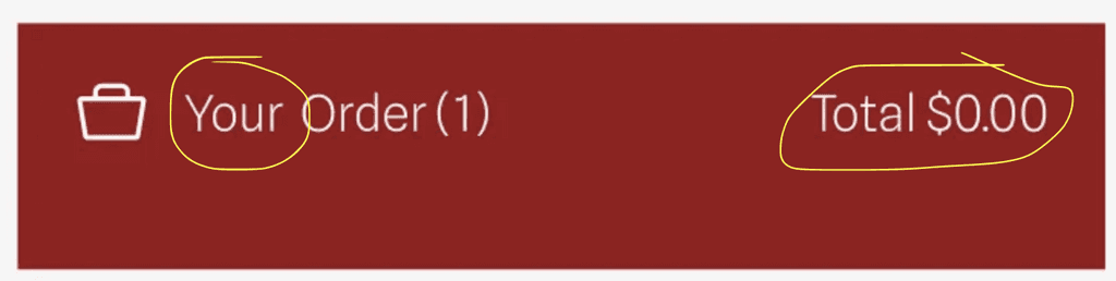
Cart was hard to see
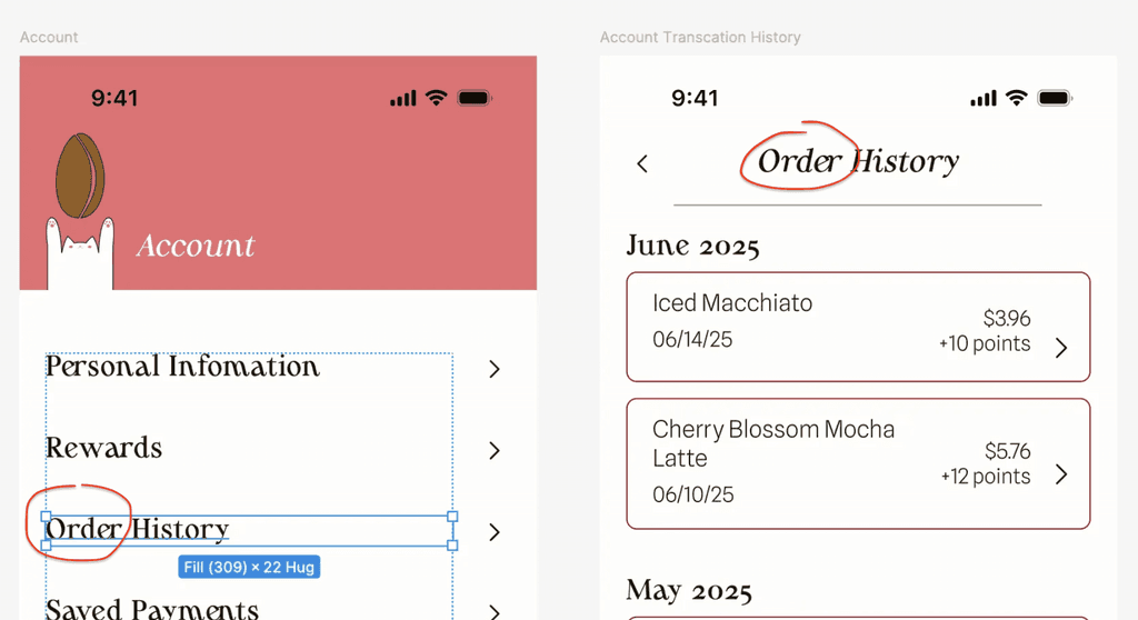
Change transaction history to order history
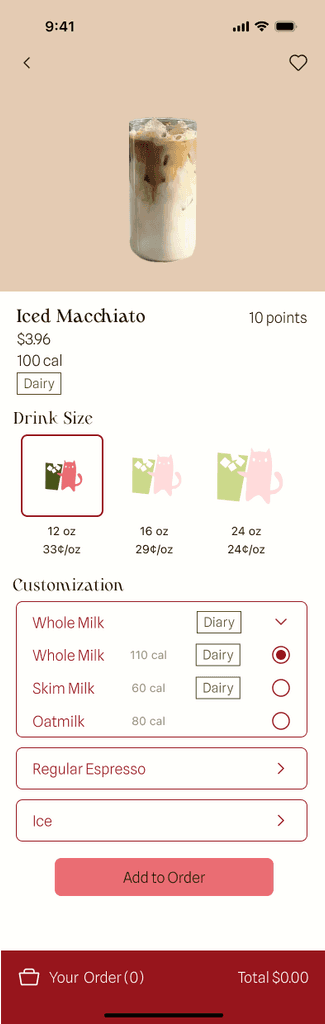
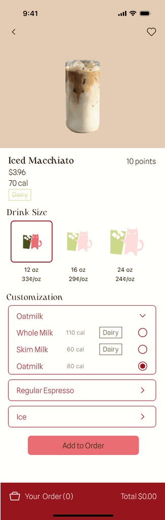
Add specified “non-dairy” allergen tag to the ingredient without dairy
Key Insights
It was hard to tell whre the cart was, and this issue was brought up multiple times
Some color changes due to readability or overall aesthetic
Changes to font/sizing/spacing/wording for clarity, readability, and consistency
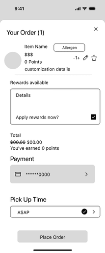
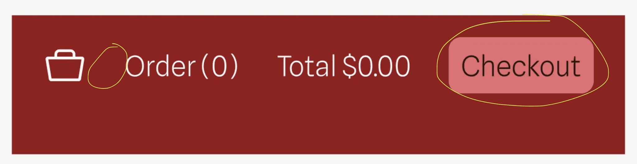
Change button in cart to say checkout, put item (1) and total $0.00. only make button clickable not the bar
Before
After
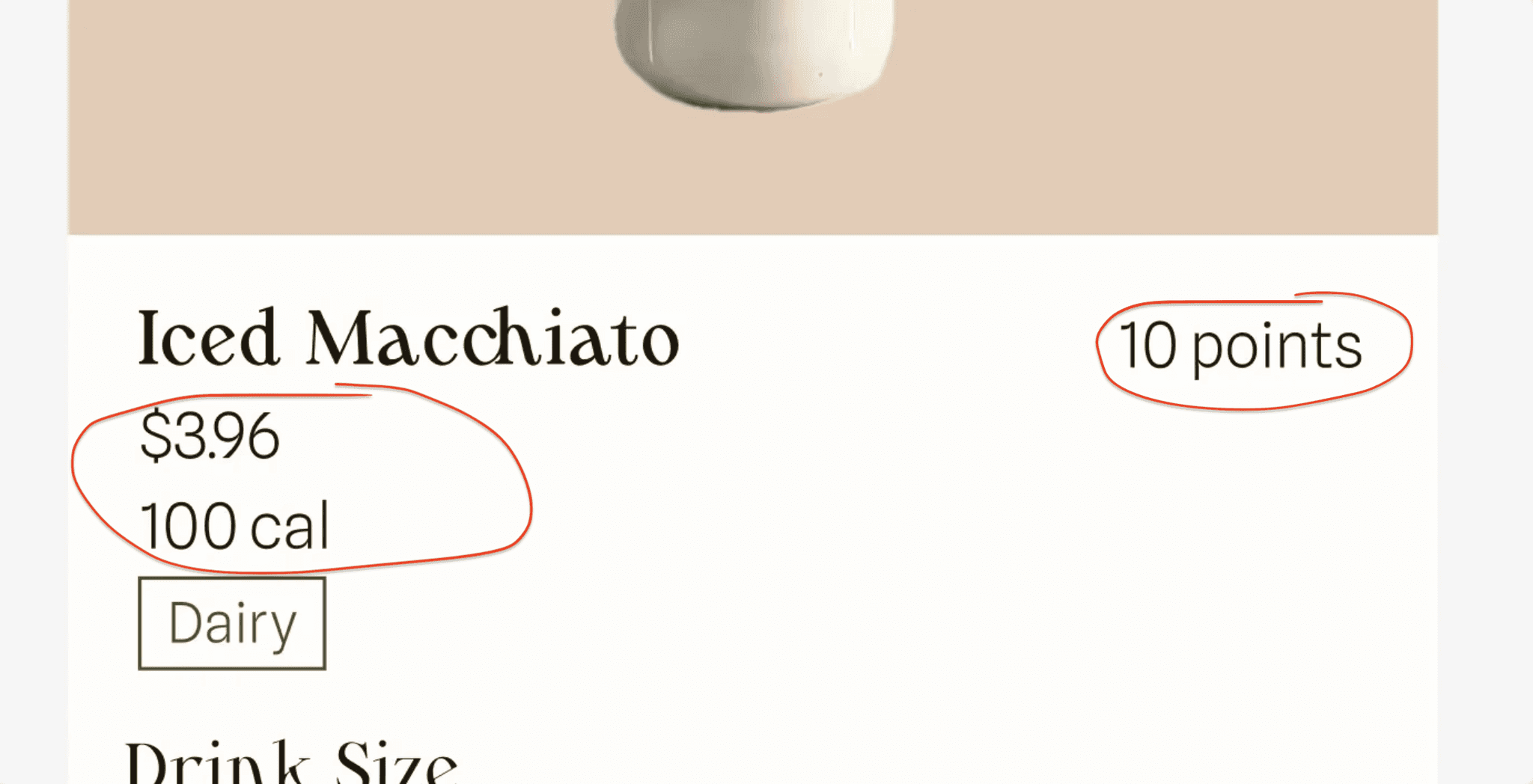
Re organize drink details (name, allergen, cal, price, points) to be more balanced
Before
After
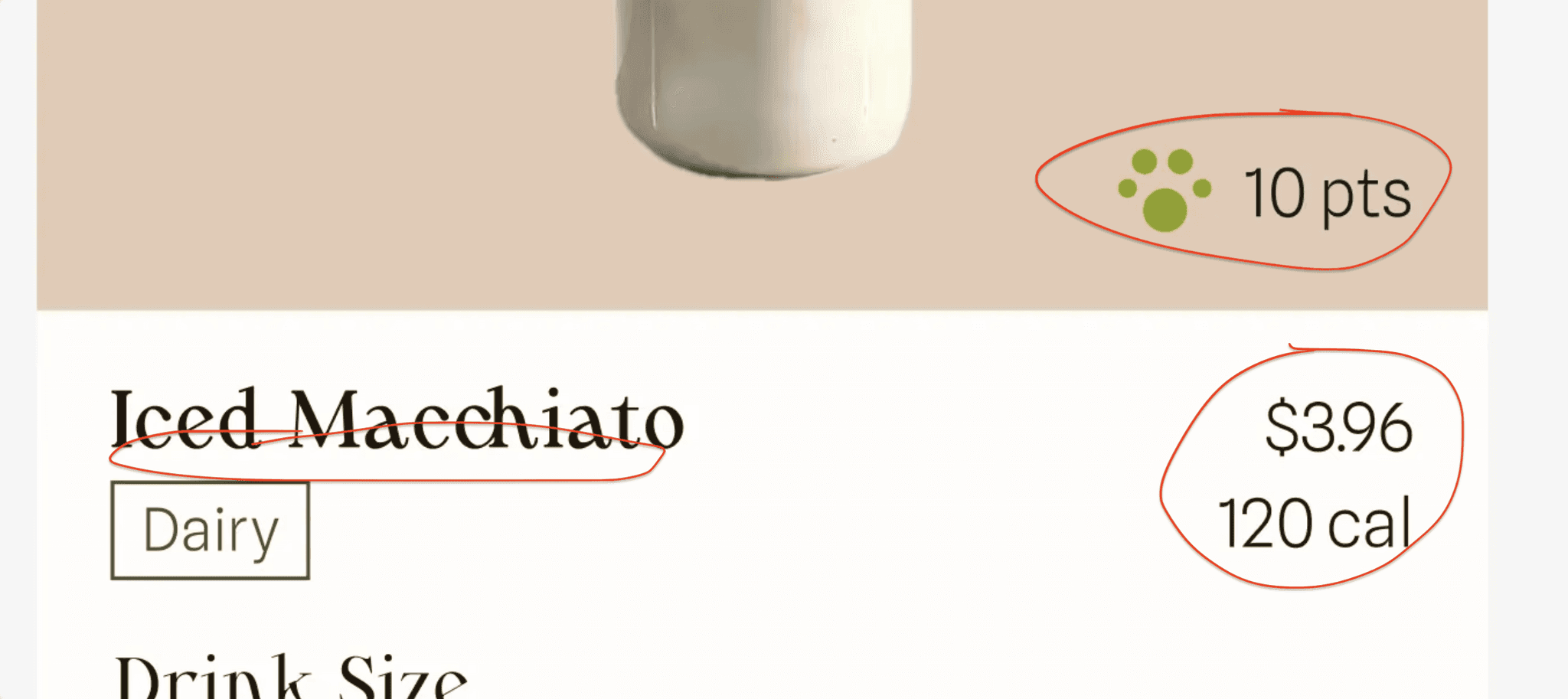
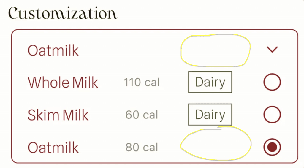
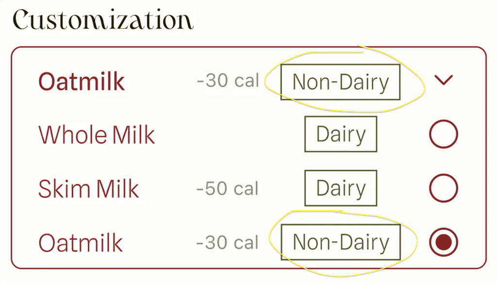
Put nondairy label on oatmilk
Before
After
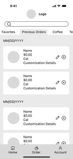
Change transaction history to order history
Before

After
Additional Changes
Grammar, spacing, subtle color shifts
Hight-Fidelity Wireframes (Version Two)

Closing
Challenges
One challenge was branding, since I had a hard time finding the right tone to convey, and also with making the style tile readable. Another one was time, since I was running behind on this project and working on two capstones at once in order to try and finish in time. It was difficult finding interviewees and testers and a short period in time, and keeping track of who I asked for feedback from and for what they were giving feedback on. Another was focus, since my project initially didn’t have enough complexity.
Growth
I learned to be flexible with my ideas, since my initial project idea needed improvement before I moved forward. I learned to manage multiple projects at once with multiple interviews and tests.
Next Steps
In future iterations, additional features could include:
Sell gift cards
Create pages or categories for items/deals for holidays
I am most proud of the overall aesthetic design of my app, since I believe my branding was done well in a way that conveyed the fresh, personable feeling I was aiming for.

