
Role: End-to-end UI/UX designer
Researching, research synthesis, wire framing, usability testing
Tools:
Timeline: February - April 2025 (~6 weeks)


Background
Problem
Idea
Finding recipes that cater to dietary needs, sometimes multiple needs at once, can be difficult and time consuming.
Many people look for new recipes online but many recipes don’t take dietary needs into account.
A website of recipes based around allergies. An efficient tagging system that makes it easy to find a recipe for any allergy, dietary preference, or nutritional need.
Researching
User Interviews
I conducted five interviews with participants between the ages of 21-75 years old in order to get a deeper understanding of the user’s needs with detailed, qualitative information.
Essential Questions
What search terms do you use when looking up recipes?
Do you use recipes on paper, mobile, desktop?
Do you have any allergies or dietary preferences? If yes, does it affect how you find and use recipes?

My questions were chosen based off of how well they helped me understand how the users used existing recipe websites, what struggles they had with existing websites, and what they thought was missing. To set my website apart from others, it had a heavy focus on allergies and dietary needs. So, to be able to add new functions that users would actually benefit from, a lot of questions also revolved around cooking with dietary preferences.
Affinity Map


Key Insights
Recipes are often reused
Time and energy impact desire to cook
All interviewees look up recipes online
None made accounts because email spam/expected cost
Fewer ingredients preferred for allergies
Recipes are often modified for allergen friendly alternatives
Competitor Analysis


Direct
Direct
Direct
Indirect
Clearly labeled recipes
Easy to read uncluttered design
Simple sort/filter
Cookbook and a shop
Ability to make account not obvious
Users could not email for help, they were directed to an FAQ page
Can make accounts to save recipes
Cookbooks for purchase
Easy to see how to make an account
Could only filter by one allergen or dietary preference at a time
Can make accounts to save recipes
Cookbooks for purchase
Difficult to see how to make an account
Could filter by multiple allergens or dietary preferences at a time
Informative
News, posts, help from doctors, recipes, and resources
Lack of features focused on recipes
Users can’t make accounts and save recipes.
No recipe comments or reviews
Key Insights
Simple design, clear labeling, clear navigation to account, filtering by multiple tags at a time, recipe ratings and reviews
Defining
During this process, I used a linear approach, and iterated on wireframes.

POV's & HMW's
I’d like to explore ways to help people with allergies/dietary preferences who cook to find allergy and diet friendly recipes because they spend time figuring out ingredient substitutions to modify a recipe to fit their needs
How might we make finding allergen/diet friendly be like finding any other recipe?
How might we help users feel confident about the allergen friendliness of their food?
How might we eliminate the need for users to substitute ingredients in recipes?
User Personas

Name
Francis Scott
Bio
Francis is a recent college graduate who started a new job a few months ago. He is often busy with his new job and multiple hobbies, so he has little time to cook and only does so out of necessity. He cooks mainly to ensure his food is wheat free so he doesn’t have to worry about getting sick. He uses recipes occasionally, looking them up on the go and bookmarking them for later to save time. He uses his phone to access the recipe while cooking.
Quote
“I cook because I want to ensure my food is wheat free and uncontaminated. I don’t have time to spend on long complicated recipes.”
Needs and Goals
Frustrations and Pain Points
Wheat allergy
Quick recipes with few ingredients
Saves, bookmarks, or quick access to recipes
Having to modify recipe ingredients for his wheat allergy takes time
Low on time
Websites with page clutter that takes time to scroll through

Name
Betsy Dobson
Bio
Betsy is retired and living at home and has ample free time. She enjoys cooking and is always looking for new recipes to experiment with. However, she is conscious about her health and wants to mostly cook nutritious vegetarian meals. She uses her laptop to look up recipes and use them multiple times a week when she cooks.
Quote
“I love to cook and spend time looking on the internet for recipe ideas I can try.”
Needs and Goals
Frustrations and Pain Points
Recipes with low cholesterol and low salt
Vegetarian
New and creative recipes at least once a week
Video demonstrations for certain steps
Spam emails when signing up for accounts to bookmark recipes
Having to switch between reading recipe and cooking
Hard to find recipes that list salt and cholesterol content
Storyboarding


Browsing recipes with cook/prep time < 20 minutes in quick recipes section
Finding recipes for certain allergies with search and filter
User Flows and Task Flows


Information Architecture
I conducted a card sort in order to help me determine my website's structure. In total, there were four closed, moderated, in-person card sorts. I used physical cards during this process.
Cards that were difficult to sort: Share recipe, Allergies, Quick recipes, Diet, Medical conditions, Share recipe, Suggestions
Cards with 25% in all categories (no majority): Review, suggestions, popular
Cards with 50/50 categories: Settings, About, Help
Half of participants said that not much would go in settings, and it can be combined with profile
Cards with split results went in main navigation

Sitemap

Designing


I chose this color palette because I thought the green was vibrant, reminiscent of wellness, nature, and plants.

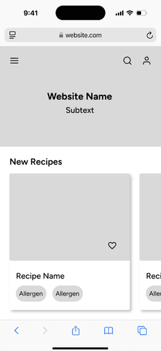
Mid-Fidelity Wireframes
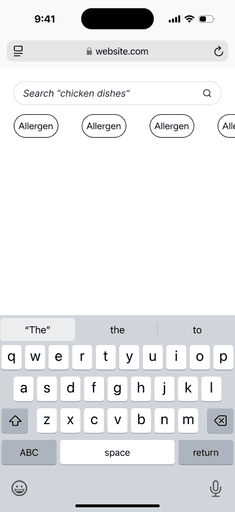
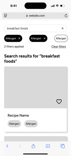
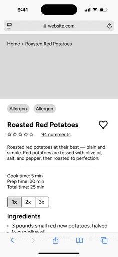
Searching and filtering flow
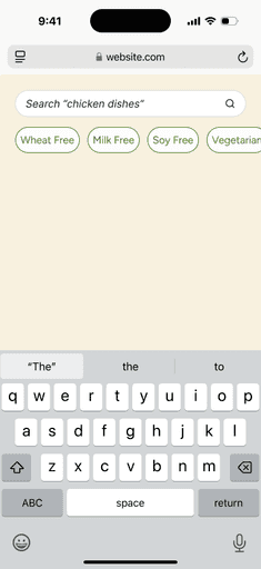
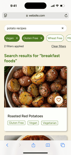
Allowing users to search for recipes and filter by allergens.

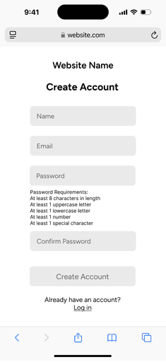
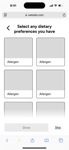
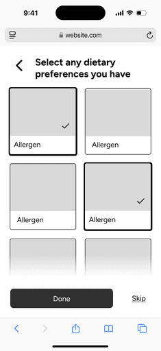
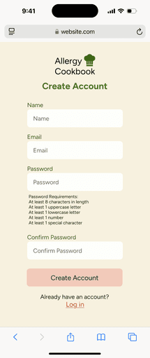
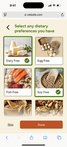
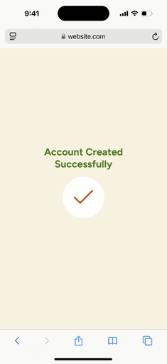
Making an account flow
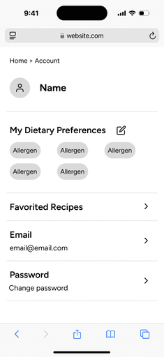
Users can make an account and select dietary preferences they have to tailor recommendations to themselves.
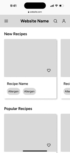
High-Fidelity Wireframes
Searching and filtering flow
Allowing users to search for recipes and filter by allergens.


Making an account flow
Users can make an account and select dietary preferences they have to tailor recommendations to themselves.


My favorite part of the design process was creating the hi-fi wireframes, prototypes, and iteration. Why? It's artistic, creative, and I love being able to see my work come to life. I appreciate being able to learn from testing and improve on my designs.
Testing
Evaluating the usability and usefulness of the wireframes. How effective is the design at helping the user achieve their goals?
Plan
Goal
Tasks
Success metrics
Evaluate the usability and usefulness of the wireframes. How effective is the design at helping the user achieve their goals?
Find a recipe using search and filter
Create an account
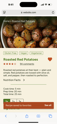
Favorite a recipe and view all favorites
Time on task
Task success
Number of errors
Additional comments
Results
9 Testers (6 moderated, 3 unmoderated)
Testing software: Maze
Time on task
Task success
Number of errors
Task 1 avg.: 148.1s
Task 2 avg.: 66.2s
Task 3 avg.: 31.9s
Task 1: 66.7% success rate
Task 2: 100% success rate
Task 3: 100% success rate
Task 1: 33% of users ended on the wrong screen, 74.9% misclick rate
Task 2: 0% of users ended on the wrong screen, 26.9.9% misclick rate
Task 3: 0% of users ended on the wrong screen, 44.1% misclick rate
User Feedback

Having never done user testing before, this process gave me a lot of insight into how differently people can use products than expected. All the issues that users were having during the first phase of testing were aspects of the flow I hadn't thought twice about. I really enjoyed testing to see how unique every tester's approach was, and being able to fill gaps in their understanding of the website in the next iteration.
Key Insights
The chef user icon was hard to see and wasn't used as much.
Users expected search to be available in the menu bar.
Changed chef hat icon so the recognizable user is bigger and the hat is smaller
Before

After

Added a search option in menu since many tired to use the menu to search and filter
Before

After

Additional Changes
Icons, navigation, buttons, sizing
Hight-Fidelity Wireframes (Version Two)

Closing
Challenges
A challenge I faced was learning to conduct user interviews. Before this, I hadn't had the role of interviewer before, so it took some time getting comfortable with asking follow-up questions, thinking on the fly, and creating a relaxed environment. Another issue I had was with creating a proper prototype. Many struggles users had during usability testing revolved around the prototype itself not being very interactive. A lot of steps had to be done in a certain order that was not intuitive. I also had trouble prioritizing tasks since there were a few different paint points I found during research.
Growth
Over the course of this project, I gained experience in the entire process of UI/UX design. I had only had introductory experience before this. The main tasks I was able to learn about and apply were user research, user interviews, use flows and task flows, prototyping, and usability testing. This project has helped me become prepared for research, prototyping, task prioritization, and knowing what tools should be used and when.
Next Steps
In future iterations, additional features could include:
Adding more tags for time, cuisine, meal of the day, basic nutrition facts etc.
More emphasis on displaying and properly labeling quick and low effort recipes
A more detailed nutrition section
Retesting hi-fi wireframes in every iteration
From this experience, I a most proud of my wireframes, color palette, and my growth. I had little knowledge about the processes of UI/UX design when I started out. I also found a new interest in prototyping and usability testing.

